

Colour vs Emotion: What do the colours of the season say about our emotional state?
Colour vs Emotion: What do the colours of the season say about our emotional state?
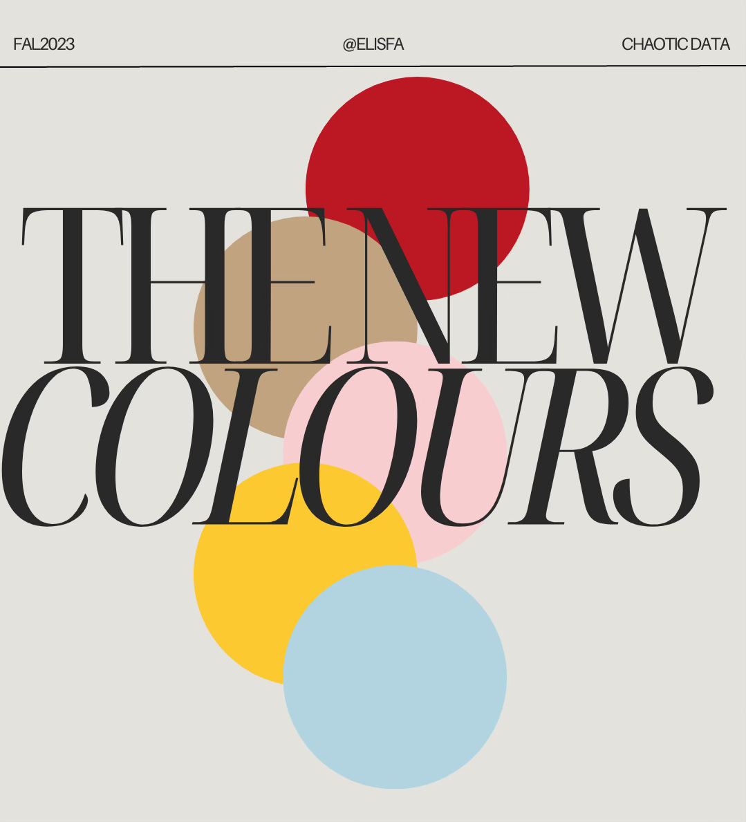
Decoding this season's trendiest hues: What each colour's emotional significance to people. Interesting enough the colour of the season is probably one season thing.

The spark for this analysis ignited as I leisurely browsed online and stumbled upon the new Jacquemus pop-up store in Seoul. With a visit to the vibrant capital of South Korea on my horizon, the allure of exploring the Le Chouchou collection housed within the whimsical Bambimou-shaped store was irresistible. Naturally, my curiosity led me to the e-shop, where I delved into what awaited me at the Café Fleurs Bambimou and, perhaps, what treasures I might take home.

To my delightful surprise, the collection was not confined to a palette of red and white, as my initial impression from the Le Chouchou runway suggested. For some reason, those two hues seemed to dominate my memory of Jacquemus's FW23 collection. Intrigued, I delved deeper, discovering that red wasn't the sole star of the Fall; instead, a palette of dominant colors lay in wait, all seamlessly showcased side by side on the Jacquemus e-shop.
*Hint inserted below*
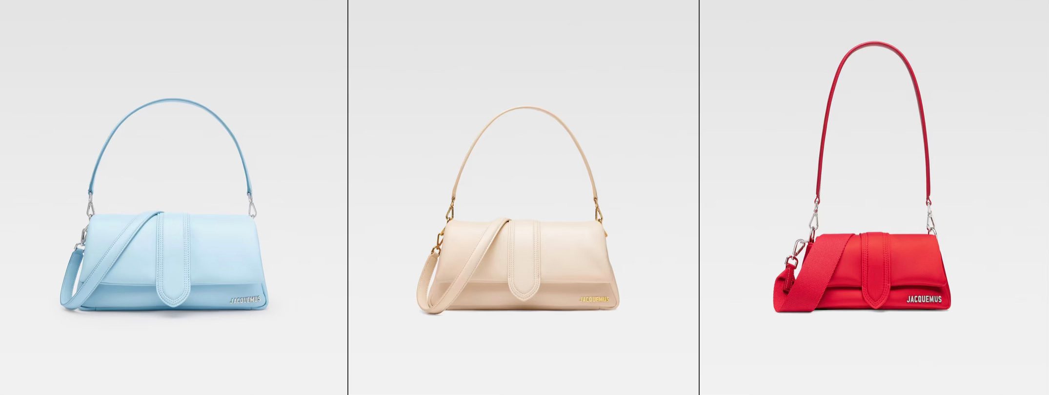
So, after running my code, the revelation unfolded that the fall's trend extends beyond the striking red palette. Nestled among the autumn hues, the serene baby blue and the comforting oat milk shades emerged as unexpected yet delightful companions. As if that wasn't enough, a subtle glimpse of pale pink and a shade I stumbled upon labeled as "pineapple yellow" added further intrigue to the mix.
But discovering this array of colors sparked a light bulb moment in my brain: what exactly do these colors mean for our psychosynthesis, and how are they going to influence our emotions during this season?
Digging into this rabbit hole led me to a remarkable paper by Boshuo Guo, offering an in-depth analysis of sentiments based on the frequency of color names on social media. Let's take a brief look at the introduction of the paper: The study explores changes in sentiment associated with eight color names over 18 months, focusing on valence. The findings reveal purple and pink consistently evoke the most positive sentiment, while brown, red, and orange consistently receive lower sentiment scores. The study suggests valuable insights for marketers, highlighting the correlation between color names and sentiment, encouraging regular analysis of social media data for informed decision-making.
In an effort to streamline your experience, I took the initiative to apply sentiment analysis to the colors of the season. Here are the key findings from this analysis:
Cherry Red: The article consistently places red among the least positively perceived colors. If cherry red falls within the category of brown, red, and orange (colours with the lowest sentiment scores), it may suggest that it is associated with less positive sentiments. Which leads into the conclusion that this colour will not survive our closets for another season.
Oat Milk: Oat milk is not explicitly mentioned in the article, so it's challenging to make specific conclusions about its sentiment. However, if oat milk is similar to a neutral colour like beige or white, it might be associated with a more neutral sentiment. Not surprising, since these neutral colours are leading the market many years now.
Pink: The article consistently mentions pink as one of the most positive colors across different datasets. Therefore, if pink is part of the colour palette for the season, it may contribute to a positive mood. Barbie era is not yet over!
Yellow: Yellow is mentioned as a relatively neutral color in some datasets, being neither the most positive nor the least positive. Its sentiment may vary, but it seems to be generally neutral. However, our season’t yellow has a tint of orange in it which might lead to a less positive sentiment associated to it in long term. We keep an eye on this.
Pastel Blue: The sentiment associated with blue varies in the datasets, and pastel blue is not explicitly mentioned. However, blue is not consistently ranked as the most positive color. Depending on how pastel blue is perceived in the context of the overall colour spectrum, it may have a neutral or slightly positive sentiment. Pastel colours generally speaking are usually associated to positive emotions.
In conclusion, the motivation behind this exploration was rooted in a desire for a more meaningful shopping experience while in Jacquemus pop-up store in Seoul. Steering away from the ephemeral allure of seasonal trends, the aim was to make purchases that would resonate beyond the current moment. Consequently, the decision-making process led to crossing out a beautiful scarf in red from the shopping list, contemplating the timeless appeal of its pink version instead or a Bambimou denim bag. The takeaway? Consider the longevity of your purchases, and perhaps, resist the urge to splurge your October salary on the perfect red item, knowing that its charm might not endure into the following year. What do you think?